Brief; to creare an installation to fill a window based on our memories of our summer, through using our primary sources of drawing, photos, videos, found objects, leaflets etc which we colleted over our 6 week break.
Proposal: I aim to have strong links between my work and the artists which I research and aim to also utilise my experiemnts in an effective way. It will all be contained in a small window. I hope I can reflect my summer experience clearly and creatively.

Thursday 10 January 2013

Final Piece Outcome: Review and Processes

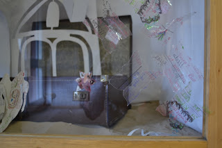
I hope that my final outcome reflects my holiday and the experience I have strongly. Placing sand on the floor also aimed to do this combined with the bright light and the interesting shapes and words coming out of the suitcase.  I think it does give viewers a sense of the summer that I had.

I think lighting is a very important element in my art piece. Particularly to create interesting shadows between the different cut-outs as they could reflect onto each other and around the space. Lighting was an important feature of my holiday which I intended to reflect in my piece conveying the bright light that was part my holiday. The other important aspect of my work which I had to consider was choosing the objects and shapes that I used; as this was the main way I would reflect my holiday to people who are viewing. These objects also had to fill my window effectively and to look like everything is popping out. When I started to hang my objects I found it difficult to hang them well in an interesting layout, as well as stopping them getting tangled and twisted together.
Challenges faced when creating my piece:
·         The array of items I had to create to fill the window successfully and for it to look effective
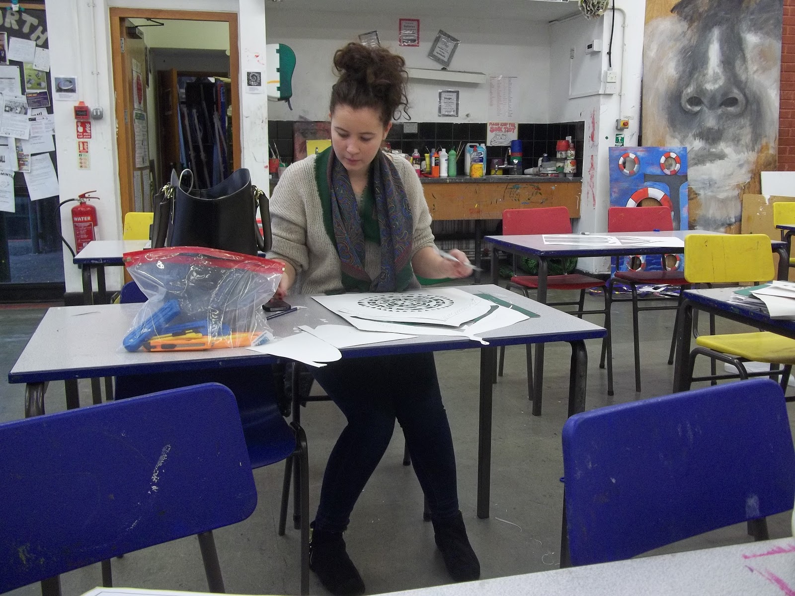
·         The detail and precison it took for the cut-outs to look effective
·         Creating a wide variation of objects
·         Making the objects look like they are popping out
·         Hanging all the objects effectively in a good order
·         Lighting the objects well to create interesting shadows

If I had the chance to re-make or improve my final outcome I would:
·         Have more detail on the bigger cut-outs of card
·         Have all the pieces of card covered in images and things I collected over the summer
·         Have more middle sized pieces of card so that, there was more variation
·         Experiment with different colours on the background, possibly black
·         Make the objects look more like they are exploding out
Artist links:
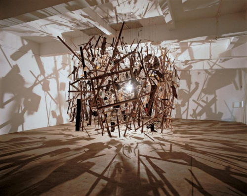
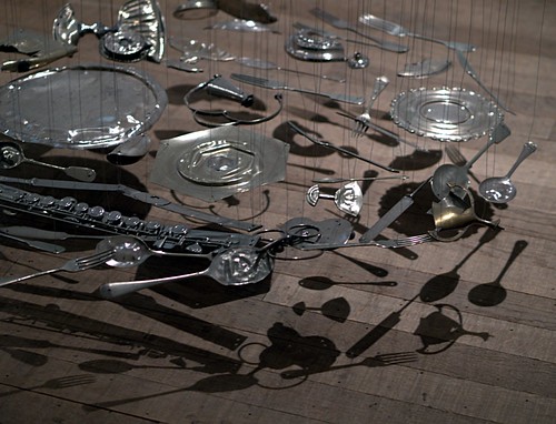
The idea of an intractive installation came when I was looking over the work of Punch Drunk. I have not taken it to such a full on level by compeletly submerging the viewer in the work, as they do- but I have tried to give a slight interaction with my work. My link to Peter Callesen is very strong as he used plain white sheets of paper to create something new using the paper cut technique. Creating works which ether coming out of the surface of the paper or become it. I found this very challanging in my work and now have a better understanding of the skill and precision it takes for him to create his amazing pieces. However unlike Callesen on some of my cut-outs I used coloured images of things I had collected or parts of my diary when I was on holiday as I thought this reflected my summer better. I also tried to use light in a strong and effective way like Cornelia Parker does combined with her idea of objects looking like they were exploding.  I tried to create the affect so that it looks like my summer holiday was exploding out of my suitcase.


Through creating this piece I have developed a number of skills. I think the skill I have most imporoved on is my attention to detail, as this outcome has lots of small details which made it succesful. This outcome also helped me to have a deep understanding of different artists work and the specific features of their style. Which I  may not have used when working on other pieces of work. This project also allowed me to explore space and the idea of layers which I found very intresting. I certainly would hope to be able to explore is area futher. I chose to layer the butterflies on the outer side of the window right at the very end. This addition to my piece allows the viewer to be able to interact with the piece by taking some of the butterflies off to reveal more of what is behind. It also allows a final layer on the work, therefore the inside of the window looks different due to the filltered butterfiles.
Over all I think My final outcome was quite succesful as I completly filled the space as well as I could and created a dynamic composition. I used paper as my main material and it was sucessful as it was easy to form into the shapes I wanted. It may have been better if it was more sturdy and strong, so that it holds its shape better though. I used light to help support my work to make it look more exciting. Finally I think I strongly refelcted the expirence of my summer and how it made me feel. I would hope that the viewer could take an understanding my expirence and that it somehow triggers a memory of their own

Monday 12 November 2012

Final Outcome Ideas

My install idea was to create an exploding chest of draws, this would link to Cornila Parker as she Dark matter where she exploded her garden shed and the put the pieces back together. I would like to have everything that was in the draws floating everywhere, hung in very precise places. I would also like to draw people who I spent my summer with this, I would paint them in Chuck Close style as well as painting particular events in a Howard Hodkin style. I would want it to look very clustered in a Punch druck kind of way by having shelfs behind.


After thinking more about my idea I starting to think about hanging the draws in a very precises way, like Cornila Parkers 30 pieces of silver, I think this would use a lot more of the space and it will look more full and would look more impacted. Pouring out of the draws will be all the things I collected over my summer, I will still like the draws to be very full of over flowing in a very clustered way which would link to Punch drunk still, I think I would still be interesting to some how incorporate the idea of portraits and paintings in the style of Howard Hodkin as well as Chuck Close.


After struggling to find the right type of draws which would reflect my summer as well as fitting in to the window and would look aesthetically pleasing, I had to change my idea to something more piratical. Like Punch Drunk I tried to sauce old and unused objects to help support my project. This lead me to the idea of creating an exploring suitcase. I found a very old and rustic suitcase which out form it will be poring everything that I would be bringing home from my holiday, this could strongly link to Cornilia Parkers Cold Dark Matter, I also would like to use light in a similar way to Parker. I would also want to incorporate portraits into think in the style of Chuck Close.

After looking over my artist I though out what responses where most effective. And I found that my responses to Peter Callesen's work were most effective. Also I would like to explore the idea of using paper in new ways. Therefore exploding out of the suitcase I will re create views, objects, arictechure and people from my holiday with paper. I think I could also link this to Chuck Close as his work makes him challenge him self and work out side his comfort zone. Although I enjoy creating installations, I found it extremely difficult to work to such detail on these pieces of paper. Also to such a large scale. I could also link to Cornillia Parker's Cold Dark Mater. As she explores the idea of exploding which I hope to reflect in my work. She also uses light as a very important source in her work, to create shadows. I hope to create shadows in my own work. I could also link to Haward Hodgkin, event through my work is in a completely different medium to he's I still want the view to feel a sense of my summer. Also the idea that they take their own memory from my memory.

Monday 15 October 2012

Chuck Close


"I went to the Seattle Art Museum with my mother for the first time when I was 11. I saw this Jackson Pollock drip painting with aluminum paint, tar, gravel and all that stuff. I was absolutely outraged, disturbed. It was so far removed from what I thought art was. However, within 2 or 3 days, I was dripping paint all over my old paintings. In a way I’ve been chasing that experience ever since."

Chuck Close (1940) an American painter and photographer most famous for his large scale photorealist portraits. Close has a condition where he struggles to depict faces and significant features be between people, this is were his intrigue began.

Close has said, "I was not conscious of making a decision to paint portraits because I have difficulty recognising faces. That occurred to me twenty years after the fact when I looked at why I was still painting portraits, why which still had urgency for me. I began to realize that it has sustained me for so long because I have difficulty in recognising faces."

Close creates a grid like method and works from photos, coping his grip from his photo to his canvas, filling in each square with as similar colours as possible. Close usually paints into the squares in a ring like way. To create these super-real images. Close’s black and white canvases are hyper-real, he took four months to create a grayscale portrait of him self. Close when on to create several of these grayscale portraitists all in huge amounts of detail and very delicious brush marks. Close’s other portraits explore this coloured ring mentored. Using Close’s grid method again he splits the photo and his massive canvas into the same grid and using the colours in it paints in a ring like form, this creates the effect that the portraits look like they are behind belealed glass. 
 
Close’s portraitists interest me, as photorealist paintings are something that I find hard to create. However Close choices to paint like this as he found it hard and challenging, as he said in an interview in 1967 he chose to make art hard for himself. That is why I find his work inspirational. I am hoping to do a few large scale drawings of people that I spent my summer which will be framed and hanging in my window, I also hope to explore his style of work using which he uses colour in a form on grid then ringing the colours. His painting like this are very beautiful as the coulors are so bright and bold. 

After trying to create a drawing in Close's hyper realistic style I found it extremely challenging, like Close I found realistic drawing really difficult. I decided to do a gray scale drawing of Bob Marely as Close also does famous people, as I listened to a lot of Bob Marley over the summer, I though he was the most relevant famous person to draw.  

I hope to incorporate Close work into my final out come, I am planing to do a set of drawings of people that I spent my summer with. I'm going to challenge my self my doing a set of drawings as I find this tequnece the most difficult, in some I would like to explore Close's use of a grip method and his use of colour.

Cornelia Parker


Cornelia Parker is best known for her Large-scale installations such as Cold Dark Matter; An exploded View (1991) Parker got the British Army to blow up her garden shed in to fragments which she gathered and hung as if it was re-exploding with a white light in the centre. The light created amazing shadows on the walls surrounding from the piece of wood and fragments of her shed. In 1997 Parker created Mass (colder Dark Matter) arranging the charred remains of a church that had been struck by lightening in Texas into an outstanding cube shape suspending from the air. Parker also created the remarkable ’30 pieces of silver’ again suspended from the air, was a series of disked filled with 30 pieces of silver or flattened and all hanging at exactly the same point in the air.


I am intrigued my Parkers work, I think her work is extremely innervate and her use of space in very interesting, particularly I like the way Parker creates shadow in Cold Dark Matter; An Exploded View, I think will out the light in the centre would make the piece completely different and not as exciting. I would hope to work with shadows in my final outcome. Also her precision of hanging everything in the right place is very skilful, I think the I idea of hanging is also something I would like to look into for my outcome as I think it could work very effectively in my window as it would be ascetically pleasing when it is interactive and when the glass closed.

Parker uses a huge range of material it would be imposable to list them all as all her works of art are so different, through out her work they idea of suspension runs through out, also Parker also explores areas of shadow.

A key feature of Parker's work is light and shadow, I hope to incorporate this idea into my final outcome. I am planning to light my objects form underneath this will create shadows in the window. Also at the back of window I'm going to fill jars with objects and then light which will again create shadows which is similar to some of Parker's work.

Friday 12 October 2012

Andy Warhol


 A leading art figure in the art movement ‘pop art’ Warhol forced the relationship between artistic expression, celebrity culture and advertisement that had taken over during  the 1960s. His work crossed across many different medias such as hand drawing, painting, printmaking, photography, silk screening, sculpture, film, and music.


Time capsules
As part of Warhol’s life work he created time capsules, collecting about 4000 audio tapes, over half a million objects, film, sculpture, painting, video art and graphic art, as well as clothing and wigs. Showing work from his public and private life. These capsules span almost 30 years, staring in the early 1960’s till his death in 1987.


Background Information
The Time Capsules are Warhol’s largest collecting project; in them, he saved source material for his work and an enormous record of his daily life. Warhol started his Time Capsules in 1974 after relocating his studio. He recognized that cardboard boxes used in the move were an efficient method for dealing with all of his “stuff.” Warhol selected items from magazines, newspapers, gifts, photographs, business records, and material that passed through his hands to put in an open cardboard box by his desk. Once the box was full he sealed it with tape, marked it with a date and/or title, and put it in his archive. As a collection this material provides a unique view into Warhol’s private world, as well as a broad cultural backdrop showing the social and artistic scene during his lifetime. From the early ’70s, until his death in 1987, Warhol created 612 finished Time Capsules.
Andy Warhol’s Time Capsules were almost completely unknown until his death in 1987. Although various studio assistants frequently handled the boxes over the years, few people recognized the enormous ammount of material. With the opening of The Andy Warhol Museum in 1994, the Time Capsules became accessible to curators, scholars, and the general public, revealing new and important information about Warhol’s life and expanding the public’s understanding of his work and practice.

Personal Analysis
I really like how Warhol created these time capsules, I think they give a great incite in to his life, it also makes you think about the things you do and the significance of objects and items in our day to day lives. I think collecting items over my summer really gave me an incite into Warhol’s colleting over the 30 years. As I collected my objects over my summer I understand how time consuming it is, as well as difficult to know what items are intresting and exciting to keep. I think both of our work reflects a time in our life and siginificant things that happened to us. Warhol's work strongly refects his memories and I hope I was able to do that in my work and throught the items I collected in my summer


Thursday 11 October 2012

Aims and Brief


Aims of the project:  The aim of the project on memories is to produce a window installation, I will looking at a wide range of artist who have ideas of memories, as well as exploring a wide range of art techqunies along side this I would also use my objects, pictures and videos that I had collected over the summer. I will also be including the idea of place when documenting my summer. I think it is important to reflect the feeling of my summer as well as including stronger links to my artist I have researched.
Primary and secondary sources:    When I was collecting my primary sources over the summer I tried to focus on four of the five senses. In my box file I included pictures and drawings alongside videos, objects which could be touched and smelt as well as many leaflets and my dairy. The most challenging sense to capture was taste; I think the only way I would be able to re create tasted is through smells
Ideas and responses:  In my responses I will be looking at artists from the lift project Dan Scott, Edward George, and Sue Mayo of whom I have met and worked with previously on the beginning stages of the window installation. I will be responding to these artists based on their specialties from my primary sources and objects that I have collected over the summer which will generate an interesting outcome.

Intended techniques media, processes and timescales:  In my project I will be using a range of media and processes to produce a set of experimentations which will be included in my final outcome, this will include:
·         Computer aided design
·         Collage
·         Reliefs
·         Sculptures/ Marquette
·         Painting
·         Drawing in a range of medium
·         3D drawing  
·         Casting

Proposed methods of review and evaluation:   As my final outcome is based to my summer holiday, I will be producing a outcome set in a window as an installation from my primary sources that I collected over the summer holiday, trying to use as many senses as possible, I will hopefully use as many techeques as possible to create the most reflective outcome.
Proposed target career:  As I am unsure what I would like to do, I would like to incorporate as main techniques as possible to create the best outcome.
Proposed method of presentation and final review:   The final outcome will be exhibited in the form of a window installation and will be constantly viewed by an audience as it is a public space. Following on from what I have learned from the artist I’ve studied and the techenqunes I have used, I want my final my outcome to incorporate all these elements. As well as reflecting the feeling of my summer.

Wednesday 10 October 2012

Valerie Jolly

The french born artist (1964) has not always been an artist. Jolly originally studied political science, then working in PR for over ten years. In 2006 she moved to London and studied Fine Art at Central Staint Martins. She is now living and working in Brussels creating her 3D drawings. Jolly creates 3D drawings in great detail.

Jolly takes casts of a range of different objects using wet tissues paper, the objects are reformed as a weightless and colour less form. In some of her works she re-draws the detail back onto the surface. Her work is extremely detailed and beautiful. I think the shadows that are created and cast once they have been reformed are particularly interesting.


I really admire the detail in Jolly's work, I think her work is facinating as I have never seen another artist who works in a similar way. After trying to cast some objects like Jolly does it has given me a better understanding of the techniques and processes and how difficult it is to create this type of work. Some of the objects I cast were more effective than others. I tried to cast a wooden coat hook however it was very difficult to peel the tissues off successfully and it ended in a mess. As it was the fist attempt at trying out this technique I had not realised how to combine the materials so that they would cast effectively.  However I also cast the light switch and this turned out to be very effective- I think because it was a plasic surface which did not absorb the moisture. After I peeled it off I delicately drew on shadows and effects which gave a three dimentional illusion just like the work of Jolly. I also casted a set of objects...


      After researching an gaining a indepth understanding of Jolly's work and how she created her pieces, Sefki and I were invited to work with a class of year 7 art specialists. We provided a short talk and discussion along side examples of her work and our own. We had to explain the ideas and meaning behind Jolly's work and the class were given an opportunity to ask us questions. I found this a really useful and interesting experience as it reenforced my understanding of Jolly's work and I felt confident in my knowledge of her techniques and processes. I was able to descibe the challenges of responding to her style to which I hope was useful for the younger pupils.


Sunday 7 October 2012

V&A

We got to the V&A in the rain, out side upside down in really high up loads of white cones, looking like a huge mouth, this got us excited to see what else we could find inside. A lot of the exhibitions inside were laded out neatly how ever very separately. In the Japanese section everything in the glass cabinets, where very fare apart with no definite link between the objects or there importance of being there. Then going into the sculpture room, they where all displayed very elegantly, as they where such strong and huge sculptures they all stood looking very powerful. We sat and drew some of these amazing peices of work. I found this quite challanging to get the angles right and for the whole thing to look in perspective. Bellow is my drawing of one of the statues.

 I think the jewellery was displayed beautifully the feel of the room made it feel a bit like an aquarium. I think is because of the low-key lighting, is enforced the jewellery and made it twinkle even more.  The small prorates where also light with low-key lighting, I don’t think this was very effective and more light would of helped to see the extreme detail in the tiny painting. 

Down stairs there was a collection of work created my man who was forced to live in an isolation in a asylum. His work was all hand crafted, also all his creations had child-like look about them. He created things such a ships, toys and playground equipment. 


I was also really intrested my the set design, they really intrested me. I think the idea of filling a space with a number of layers. Also about filling a space however it still have to be pratical and work for it purpose to support the play it it for. I think this idea of layering will flow every easierly into my final piece, layer will be very helpful for making an installation art piece really intresting. Set design is an area that I would like to explore further.

Wednesday 3 October 2012

Peter Callesen


First impressions

      Callesen's work intrigues me how he can create these new forms by cutting from a plain A4 sheet of white paper. I like the detail of his work, also the simplicity of it, particularly how a lot of his work looks at the differences between life and death through negative and positive spaces. Some of his most remarkable works are where the remains of the cut and folded objects become shadows of the objects former self. He uses the positive and negative space to tell a sometimes-dark story about the past and future of his subject.

Background Information
     Callesen was born in Denmark in 1967, and started his studies at Goldsmith college London. Callesen's work deals with themes such as life and death as well as memories and fairy tales by starting with a simple sheet of white paper and cutting very precisely to create extremely detailed 3D work.

http://www.petercallesen.com/about/

Materials and Processes
      "Lately I have worked almost exclusively with white paper in different objects, paper cuts, installations and performances."  A large part of Callesen's work is made from A4 sheets of paper. He says he uses this as it is probably the most common and consumed media used for carrying information today and adds: "This is why we rarely notice the actual materiality of the A4 paper."
Using a fine scalpel and a plain sheet of white paper or card, Callesen cuts away areas of the sheet creating new images often representing life and death. This effect is created because of the positive and negative outcomes.
  He says: "The paper cut sculptures explore the probable and magical transformation of the flat sheet of paper into figures that expand into the space surrounding them. The negative and absent 2 dimensional space left by the cut, points out the contrast to the 3 dimensional reality it creates, even though the figures still stick to their origin without the possibility of escaping. In that sense there is also an aspect of something tragic in many of the cuts.’’ 
   Clearly the processes he uses are very time consuming however very effective. For me to achieve the same level of skill I think it would take a huge amount of pratice. I would like to incorporate his processes somehow into my final piece, though.

Personal Analysis
Callesen's working is very exciting and I appreciate the ornate detail in his work. Also how he can convey a powerful message of life and death, through such simple images.The effect of the ice burgs melting away from the ship is very interesting, also the amount of detail on the sinking ship is amazing and precise.

After creating a response to Callesens work using some of my own objects I understand the amount of detail that goes into his work, also I found it challenging working out what pieces to cut away and which to keep so that the whole thing did not just fall out. On the left is my most successful response as I think it has the most like-ness Callesen's. It is successful as it is very detailed and I really tried to consider which pieces I could take out and from that what was left. Also I worked on white paper which Callesen always does, I think this makes the outcome look more clean cut and fresh. I also created another response to Callesen's work (right). This response was less effective as I believe too much of the paper was cut away, also the piece is not as delicate as Callesen's work is. I think another reason why I think this piece is less effective is because I  chose to experiment by using another yellow paper, I think this takes away from what is happening on the page and is not a crisp as the white paper response. 


Comparison
   I think there are strong links between Peter Callesen and Valerie Jolly's work. They both use very simple material to create pieces of art which are in great detail. Both artists work takes a lot of precision and the more you look at them the more interesting they become. Both artist explore the idea of 3 dimensions in an interesting way. 


      Exploring and researching Peter Callesens work has made me consider ideas for my own final piece. I hope to use his techniques as some of my experimental outcomes were really effective. The simplicity of Callesens works is something I would like to capture in my installation and the techniques would be an interesting way to develop and transform my collected items. I also think it would give the viewer an opportunity to interpret the objects in their own way. Another thing which is interesting to explore is the conflict between the simplicity of using white paper and the paper cut techniques and the complexity of the process of creating the cuts. I would like to possibly pursue this further with a range of different size papercuts and challenge myself with different objects That I have collected.

Monday 17 September 2012

Andy Warhol


A leading art figure in the art movement ‘pop art’ His forced the relationship between artistic expression, celebrity culture and advertisement that flourished by the 1960s. He’s work crossed across main different medias such as hand drawing, painting, printmaking, photography, silk screening, sculpture, film, and music.


Time capsules
As part of Warhol’s life work he created time capsules, collecting about 4000 audio tapes, over half a million objects, film, sculpture, painting, video art and graphic art, as well as clothing and wigs. Showing work from his public and private life. These capsules span almost 30 years, staring in the early 1960’s till his death in 1987.

I really like how Warhol created these time capsules, I think they give a great incite in to his life, it also makes you think about the thing you do and the significant of objects and items in our day to day lives. I think collecting items over my summer really gave me an incite into Warhol’s colleting over the 30 years. 

A lot of his work is about how things are placed and about putting the important things on the top, what would look exciting. The picture bellow looks intresting because of the amount of things that are there, also the extrem detail on all of things he has collects. The fact the the objects are all kinds of things i think also makes it look intreging and fasinating to look at.   


Warhol's time capsuls are unlike a lot of his other work, all though the time capsuls are still about life style and fame, its not like his other Pop art work. Warhol's other work used a lot of bright colours and a very strong bold pieces looking at celebries and the whole idea of fame.

Howard Hodgkin Responce

After learning about Howard Hodgkin I created a responce. 

Sunday 16 September 2012

Punchdrunk


Punchdrunck are British Theater Company who began in 2000.
They set out to create an experience through the use of installation art and performance, that audience are free to roam and discover different part of the whole experience. Working with communities and school to give people this unique experience.

As an installation art group, Punchdrunk used a wide range of materials depending on the project. They collect and recreate objects to create a feeling, vibe or emontion.


I love how interactive and exciting Punchdrunk’s work is, also that fact that the experience you take from one of there performances would be completely different to everyone else’s. I think this is mainly down to the extreme attention to detail, which I would hope to carry into my work. 

http://www.youtube.com/watch?v=L_BKN6tzrYI&feature=plcp

Punchdrunck would inspire my prodject as they think about all angles and  filling the whole space in an intesting way, I think after looking at there work I think I would like to make my instollation more intractive.I think as there bicker brack prodject was a lot about objects and I collected my objects and images of my summer. 


Its part of Punchdrunks are to see and understand the responce of what they have created, I hope I can continue this idea into my work. The idea of an intractive illsolation I find extreemly intresting as all Punchdrunks work is very memerable and very unique to them.
After looking at their work I have been thinking of ways to incorporate these ideas into my work. I am thinking about something with draws that people can come and see whats inside like Punchdrunks bric a brac shop. I think this is would be challenging as I do not have the time or materials which Punchdrunk have, how ever I think it is possiable to do something on a smaller scale which in unique, intresting and interactive.

I think Punchdrunk could strongly link to Flack as she also looks at an array of objects to create a feeling, person or emotion. However Flack's work is through painting and Punchdrunks work is trough installation, the feeling that the work creates are very similar. Also both of there work has a cluttered and full look, I think both of there work is very intrersting as there is so much to see and pick apart from them.

http://billiefmiller.blogspot.co.uk/2012/06/audrey-flack-she-has-taken-signs-of.html

Tuesday 26 June 2012

Audrey Flack

"She has taken the signs of indulgence, beauty, and excess and transformed them into deeply moving symbols of desire, futility, and emancipation."

Flack (1931) is an American born sculpture, printmaker and most famously photorealist paint. Over the years has won many awards.

Flacks work is very interesting and exciting; the extreme detail the precision in her working is amazing. I like how she gathers thing from a memory or memories brings them all together takes a photo then paints from the photo. It’s interesting how she paints from the photo not just straight from the objects?
I think it would be extremely difficult for me to create a response to Flacks work and I struggle with creating photo realism, I will try and take Flack attention to detail and reflect in my work. I am interesting in understanding the random-ness of the objects and how they reflect a memory to Flack how ever the view would take something completely different from the objects.
I tried to create a response using the objects which I collected over the summer, I tried to layer a lot of my objects on top of each other, I really struggles with getting things to be coming from different angles. After photographing my arrangement like Flack does. After that I photo copied the photo and tries to paint on to the clear line photo copy. I found this very challenging to get it too the huge amount of detail Flack reflects in her work. Also I understand how time conduming it would take to paint a whole picture. After trying to paint the whole of my image in such detail, I found it extremely difficult as painting is not one of my strong suits, it was really hard work for me to look at all of the detail and trying to make it look as like the photo as possible, and in the more realistic way.

Flack mainly uses paint on to canvas for her work, after arranging a wide range of objects to create a feeling, mood to the vibe of a person.  Flack collects an arraignment of objects and places them in interesting and exciting ways, she often tries to make things feel like they are coming from different angles.

I hope to arrange the objects in my window in a Flack style, as I'm going to fill shelves at the back of my window and I hope to fill them in a full way in which Flack does, also I will think about the way the objects are formed together in different angles as Flack does.


After looking at the work of Flack, I think her work strongly link to window design which I'm very interested in. I saw this window in a Topshop store and thought it was very similar to a lot of Flacks work. 

Colour

What is colour?

 The idea that nothing has any colour and only obsorbs wave lengths which your eyes take in and tell your brain what colour to understand it is.

Clolours are made up of the key primary colours red, blue and yellow then by mixing them to differnet amounts you can make any other clour. All colours are made by waves and different waveslengths depict different colours. A typical human eye will respond to wavelengths from about 390 to 750 nmIn terms of frequency, this corresponds to a band in the vicinity of 400–790 THz. A light-adapted eye generally has its maximum sensitivity at around 555 nm (540 THz), in the green region of the optical spectrum.

http://www.youtube.com/watch?v=arZRYbtb20M&feature=related

http://www.colourlovers.com/blog/2008/03/24/modern-color-field-artists-using-the-full-spectrum/


Thursday 14 June 2012

Howard Hodgkin

“I have never enjoyed printmaking. But I equally hate painting. I am growing old and I do what I can do.” Howard Hodgkin

http://www.guardian.co.uk/lifeandstyle/2009/jan/10/howard-hodgkin-art-interview

First impression, after looking over a few of Hodgkins work I did not truly understand these messages he was trying to make through his work, I think is might be because the work is so personal to Hodgkin and his memories. He work is quite enclosed to his own emotions and responding to his own experiences it is quite hard to interpret. The key features I noticed so Hodgkins work were the bold colours like lots of picasso’s later work. Also strong shapes such as squares and triangles, I think this has some reflection of cubism. I also noticed the detailed patterns, some pattern look very naively places and just splashed on, this could be Hodgkin wanting to imidetly refect how he felt at the time of the memoney, however some other marks look very much more placed. I think these were place later on when he went back to his work and tried to remember the memory.
After researching Howard Hodgkin I have discovered that Hodgkins intentions to make the views feel something, it does not matter if the emotions is realted to his he just wants an emotion. I think this is a very cleaver concept which I would hope to care into my work. Hodgkin uses pre-used frames and creates his own painted frame on top. Hodgkin uses bold coulors to convay emontion or a memory.


Sir Gordon Howard Eliot Hodgkin (1932) an abstacted britsh painter and prinkmarker. Hodgkin won a Turner prise Hodgkin was the cousin of Eliot Hodgkin (1905-87) whos work was very different, as he offtern painted fruit in a very realist style.

 http://poulwebb.blogspot.co.uk/2010/09/howard-hodgkin.html